Showing posts with label Report. Show all posts

Tuesday, 26 July 2016

Jet Professional 2017 - Introduction and Installation

Why to switch to and What's New in Jet Professional 2017?

Its valid question same came to my mind also when i heard about new Release.

Then i tried to explore a bit about it and got an information about some exciting features introduced with it. I will discuss as i progress with my evaluation and exploration with these features.

Here i am giving bit overview about some features and limit to Installation topic in this post. If you wish to know more you will have to wait for my next few upcomming posts.

As per Jet Report Sources:
Jet Professional 2017 makes sharing your reports easier than ever before!  

Reporting with (and without) the Jet add-in for Excel

The Jet Web Portal is an online interface that provides an easy-to-manage repository for your organization’s reports.

Using the web interface and Office 365 Online, you can allow any of your network users – whether they have Excel and the Jet add-in installed or not – to view reports directly from their web browser.

Jet Mobile for Jet Enterprise

Jet Professional integrates with the Jet Mobile web client – allowing you to log into one site to see and run all your reports - and to see all of your business intelligence dashboards.

And... Jet Mobile for Jet Enterprise includes many new features - making your dashboards more powerful and even easier to use.

What's New?

Publishing to the Jet Web Portal


The Jet ribbon within Excel includes the ability to publish your reports to the Jet Web Portal.  The Jet Web Portal provides a manageable repository for your organization’s reports. All your users – whether they have Excel and Jet Professional installed or not – can run and view reports directly from their web browser.


What is Jet Web Portal


Jet Professional 2017 represents a new way to manage, run and view your business reports. Designed for today’s always-connected, always-moving workforce, Jet Professional 2016 introduces a new Information Management System that allows business users access to their business reports using virtually any device through a simple web interface.


As a user, you don’t need to install anything to run and view reports. Within the Jet Web Portal, you can quickly find the report that you’re after, specify report parameters, run the report to get up-to-the-minute data and view it in Excel Online.


With features like sharing, search, version control and report permissions, Jet Professional 2017 is a complete report management system.


Will comeup with more detailed about new features in my upcomming posts.

Let us move to Installation part.

To get the installation file go to this link : https://www.jetreports.com/support/product-downloads/

After downloading you will get the Jet Professional Installation Files.Zip, extract it.

Install-1

Befor you start installation make sure no Excel instance is running on your system.

I am doing simple one system Instalation, will come up with more details and other options later.

Double click to Setup file to begin with installation.

Install-2

If you have Activation code enter it or you can continue and activate later.

Install-3

Select instalation type as desired, i am installing All Components.

Install-4

Select the features you want to install, since i am performing complete install, so i am accepting all as suggested by default.

Install-5

Select the Account to run the service, and don't forget to select Add rules to Windows Firewall. Rest all as default suggested.

Install-6

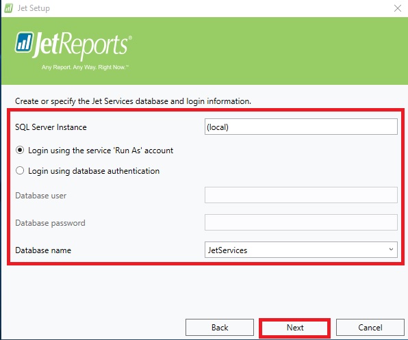
Select the SQL Instance for Jet Service Database and login method.

Install-7

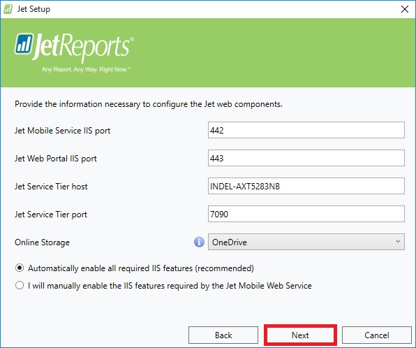
Select desired ports and host detail or accept as suggested as default.

Install-8

Enter Jet Service Tier details or accept suggested as default.

Now your pre-configuration part is completed. Click on Install to proceed with Jet Components Instalation.

Install-10

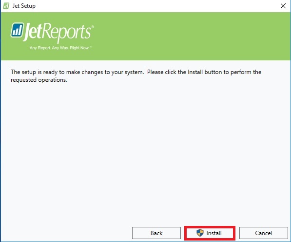
Click on Install to proceed.

Install-11

Click on Finish to exit Instalation wizard, your Jet is now installed with above provided configuration.

Install-12

Next Step is to Activate your Jet Professional.

From Jet Tab on Ribbon select Activate Jet Professional.

choose the desired option.

Install-13

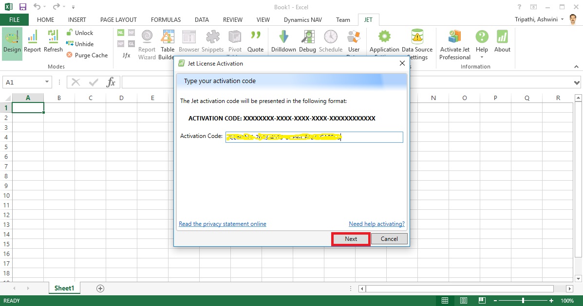
Enter your activation code and click on Next.

Install-14

Copy the message and send to the mentioned e-mail id and click Next.

Install-15

Close to exit.

Wait for the Activation Token, it may take upto 24 hours to receive mail with this code.

Install-16

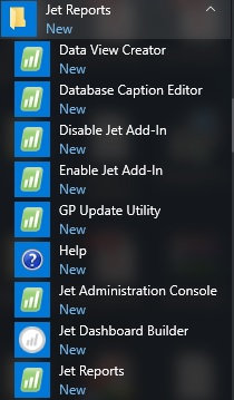
If you check your Start Menu you will find these components got installed.

Install-17

Once you receive your Tocken.

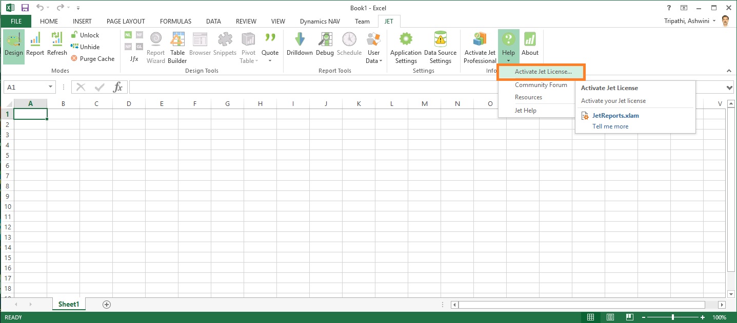
Launch Excel, From Jet Tab, Click on Help from ribbon and select Activate License.

Install-18

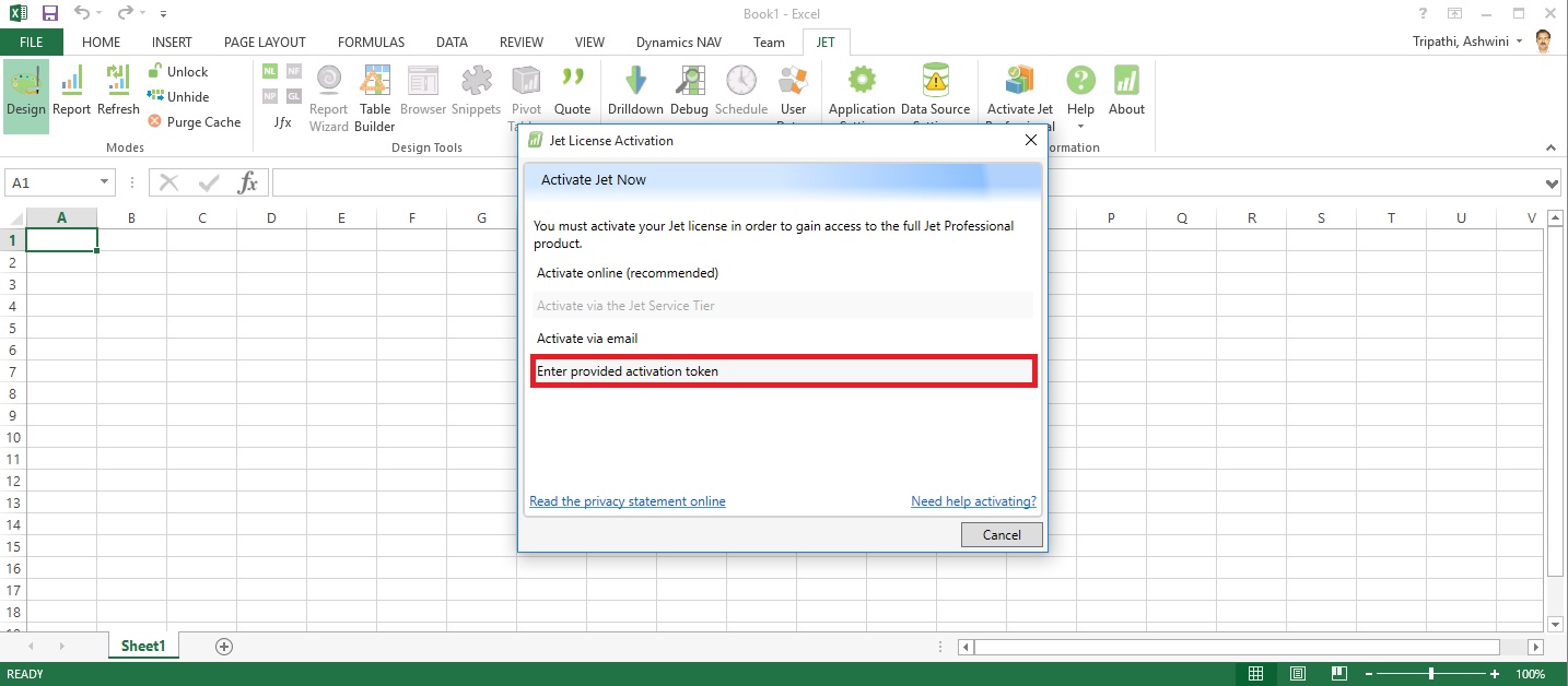
Select Enter provided Activation token.

Install-19

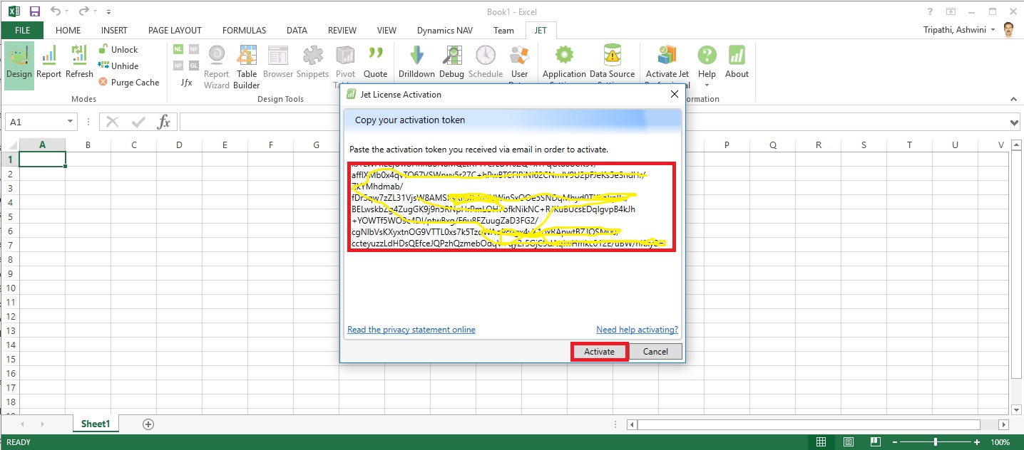
Copy the Token you received via mail here and click on Activate.

Install-20

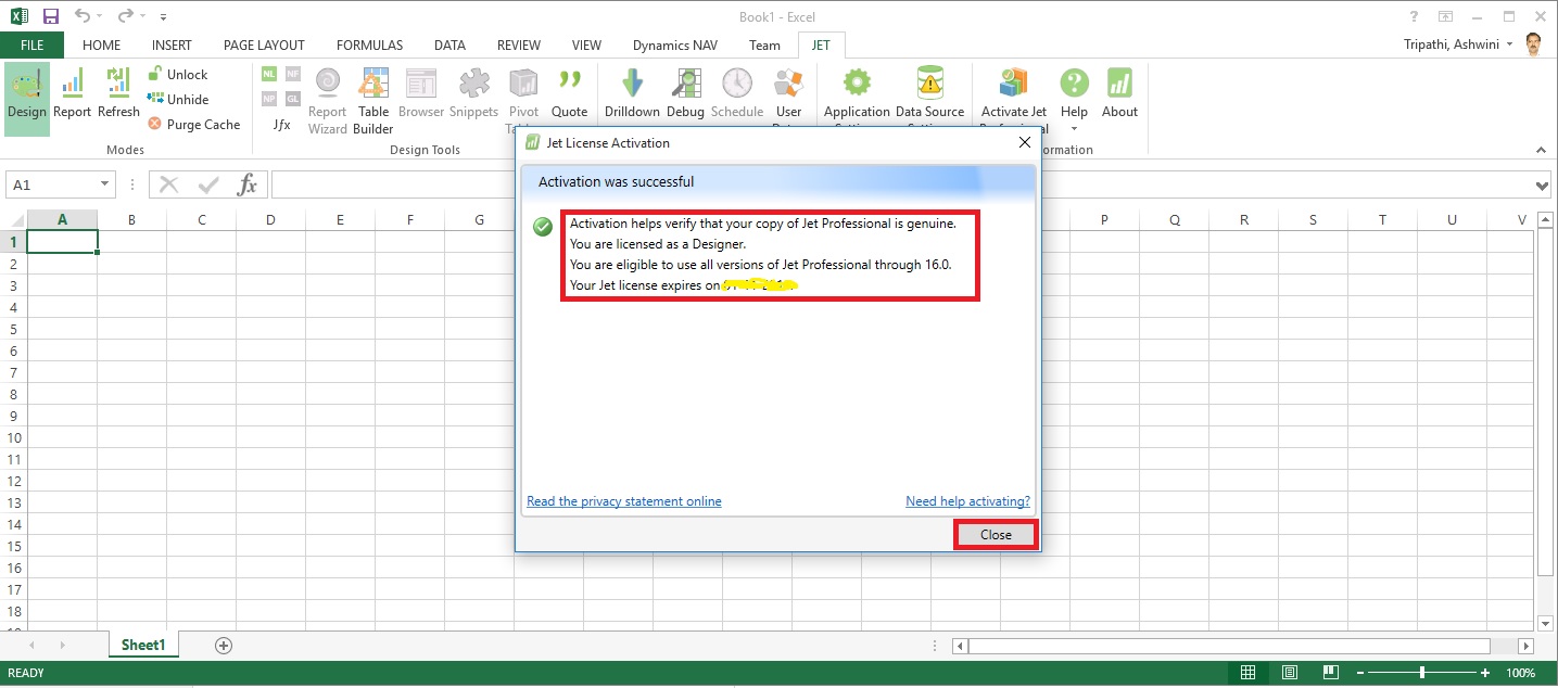
If every thing is fine you will receive the Activation Successful message.

Now you are ready to start with using Jet Professional.

I will come up with more details on this in my upcomming posts till then keep exploring and learning.


Wednesday, 20 July 2016

Open Report Design in Visual Studio from Custom Report Layouts

You may have noticed that when we try to edit Report Layout from Custom Report Layouts Page, it always open in Word or Report Builder no direct option to edit it in Visual Studio.

This requirement leaded to the necessity of the below customization, It can be done other ways also but the easiest way to do it one which i am going to discuss in my today's post. Hope you will like it.

CustRepLayout-1

I have provided with the option where user can select the desired Editor either he wants to open it in Report Builder or Visual Studio.

To achieve this i have added one field in Table 9650 - Custom Report Layout with desired options as shown below.

CustRepLayout-2

And made this field available in Page Custom Report Layouts - 9650 as shown below.

CustRepLayout-3

Now in Codeunit 9652 - Edit RDLC Report Layout I have replaced the code shown in Yellow with the code shown in Red box.

CustRepLayout-4

CustRepLayout-5

Thats all, what you are waiting for go-ahead and design the reports in your way.

I will come up with more other topics in my upcomming posts, till then keep practicing and learning.


Tuesday, 31 May 2016

Plug & Play - Power BI and Jet Enterprise in NAV 2016

This is where Power BI and Jet Enterprise really shine – they have the ability to understand NAV because they have little bundles of interpretation packs that can interpret NAV for you!

Checkout more via below shared link :-

http://www.catapulterp.com/plug-and-play-power-bi-and-jet-enterprise-in-nav-2016/

Wednesday, 20 April 2016

Financial Statements and Data Warehousing (Jet Reports)

Learn how a data warehouse makes creating financial statements from multiple systems fast and easy by storing all of your data in a single place that is optimized for end user reporting.

Video-1
http://jetreports.wistia.com/medias/018bcsea5n?embedType=iframe&videoWidth=640

Video-2
http://jetreports.wistia.com/medias/93wgjbfxep?embedType=iframe&videoWidth=640

Wednesday, 7 October 2015

Create a Power View report

In the previous post, we created an Excel workbook with a PivotTable containing data about Olympic medals and events. If you didn’t saw the previous post you can access from here.

Use hierarchies in PivotTables

In this post, we will create a Power View report to visually represent the Olympics data.

In Excel, click INSERT > Reports > Power View Reports.
ExcelData-22

ExcelData-23

ExcelData-24
Select City from Host & Sport from Medal Table. Apply Count (Not Blank) to Sport Field using dropdown list next to Field Name.
ExcelData-25
From design switch the Visualization to Map.

On the map, blue circles of varying size indicate the number of different sport events held at each Olympic Host location.
ExcelData-26
Drag Season Field to Color area. This will add different colors for different Seasons. In our case summer/Winter Red/Blue colors.

Just in few clicks now we have a Power View report that visualizes the number of sporting events in various locations, using a map, color-coded based on season.

Will come with more details in my upcoming posts, till then stay tuned, keep learning and practicing.

Tuesday, 6 October 2015

Use hierarchies in PivotTables

Recall from my previous post Create a hierarchy in PowerPivot Data Model, We will continue from where we left our earlier post.

Now we have a Sports hierarchy and Locations hierarchy, we can add them to PivotTables or Power View, and quickly get results that include useful groupings of data.

Prior to creating hierarchies, you had to add individual fields to the PivotTable, and arrange those fields how you wanted them to be viewed.

In this post we will use the hierarchies created in the previous post to quickly refine our PivotTable.

Open the Excel workbook which we used in our previous post and Insert PivotTable as shown in below screen.
ExcelData-17

  • Add field in the PivotTable Medal from Medal Table in the FILTERS area, and Count of Medal from Medal Table in the VALUES area. Your nearly empty PivotTable should look like the following screen.


ExcelData-18

  • From the PivotTable Fields area, drag SDE from the Events table to the ROWS area. Then drag Locations from the Hosts table into the COLUMNS area. Just by dragging those two hierarchies, your PivotTable is populated with a data, all of which is arranged in the hierarchy we defined in the previous steps. Your screen should look like the following screen.


ExcelData-19

  • You can expand any of those Sports in the PivotTable, which is the top level of the SDE hierarchy, and see information in the next level down in the hierarchy (discipline). If a lower level in the hierarchy exists for that discipline, you can expand the discipline to see its events. You can do the same for the Location hierarchy, the top level of which is Season, which shows up as Summer and Winter in the PivotTable.


ExcelData-20

ExcelData-21
By dragging those two hierarchies, you quickly created a PivotTable with interesting and structured data that you can drill into, filter, and arrange.

I will come up with more details and other options on this topic in my upcoming posts. Till then keep learning and practicing.

Monday, 5 October 2015

Create a hierarchy in PowerPivot Data Model

We will be using the Excel workbook we used in our earlier posts. Open the Excel file, you can find the link for download in my earlier posts or from blog Menu.

SharePath

Most Data Models include data that is inherently hierarchical. The Olympics data is also hierarchical. It’s helpful to understand the Olympics hierarchy, in terms of sports, disciplines, and events.

For each sport, there is one or more associated disciplines (sometimes there are many).

And for each discipline, there is one or more events (again, sometimes there are many events in each discipline).

The following Table illustrates the hierarchy.

ExcelData-13

In this post we will create two hierarchies within the Olympic data. Then use these hierarchies to see how hierarchies make organizing data easy in PivotTables and in Power View in upcoming posts.

Create a Sport hierarchy

In Power Pivot, switch to Diagram View. Expand the Events table so that you can more easily see all of its fields.

ExcelData-14

  • Press and hold Ctrl, and click the Sport, Discipline, and Event fields. With those three fields selected, right-click and select Create Hierarchy. A parent hierarchy node, Hierarchy 1, is created at the bottom of the table, and the selected columns are copied under the hierarchy as child nodes. Verify that Sport appears first in the hierarchy, then Discipline, then Event.


ExcelData-15

  • Double-click the title, Hierarchy1, and type SDE to rename your new hierarchy. You now have a hierarchy that includes Sport, Discipline and Event. Your Events table now looks like the above screen.

  • Still in Diagram View in Power Pivot, select the Hosts table and click the Create Hierarchy button in the table header, as shown in the following screen.


ExcelData-16

  • An empty hierarchy parent node appears at the bottom of the table.

  • Type Locations as the name for your new hierarchy.

  • There are many ways to add columns to a hierarchy. Drag the Season, City and NOC_CountryRegion fields onto the hierarchy name (in this case, Locations) until the hierarchy name is highlighted, then release to add them.

  • Right-click EditionID and select Add to Hierarchy. Choose Locations.

  • Ensure that your hierarchy child nodes are in order. From top to bottom, the order should be: Season, NOC, City, EditionID. If your child nodes are out of order, simply drag them into the appropriate ordering in the hierarchy. Your table should look like the above screen.


Your Data Model now has hierarchies that can be put to good use in reports. In the upcoming posts we will learn how these hierarchies can make our report creation faster, and more consistent.

Stay tuned for more details, will come up with usage of hierarchy in my upcoming post.

Till then keep learning & practicing.

Sunday, 4 October 2015

Extend the Data Model using calculated columns

Recall from my previous post Add a relationship using Diagram View in Power Pivot

Which I have left with below note. I will be continuing from where I left my previous post.

It’s nice when the data in your Data Model has all the fields necessary to create relationships, and mash up data to visualize in Power View or PivotTables. But tables aren’t always so cooperative, so in today’s post will describe how to create a new column, using DAX that can be used to create a relationship between tables.

Open the Olympics Excel sheet which we used in our previous post.

ExcelData-7
Delete the column EditionID from sheet Medals & Hosts Table/Sheet.
ExcelData-8

After deleting the Column EditionID from Table/Sheet Select Update All in Ribbon from PowerPivot Tab. This will update the column in Data Model.

Since we are going to learn creating relationship on calculated fields.

In Hosts, we can create a unique calculated column by combining the Edition field (the year of the Olympics event) and the Season field (Summer or Winter). In the Medals table there is also an Edition field and a Season field, so if we create a calculated column in each of those tables that combines the Edition and Season fields, we can establish a relationship between Hosts and Medals. The following screen shows the Hosts table, with its Edition and Season fields selected
ExcelData-9

Select the Hosts table in Power Pivot. Adjacent to the existing columns is an empty column titled Add Column. Power Pivot provides that column as a placeholder. There are many ways to add a new column to a table in Power Pivot, one of which is to simply select the empty column that has the title Add Column.

In the formula bar, type the following DAX formula. The CONCATENATE function combines two or more fields into one. As you type, AutoComplete helps you type the fully qualified names of columns and tables, and lists the functions that are available. Use tab to select AutoComplete suggestions. You can also just click the column while typing your formula, and Power Pivot inserts the column name into your formula.
=CONCATENATE([Edition],[Season])

When you finish building the formula, press Enter to accept it.

Values are populated for all the rows in the calculated column. If you scroll down through the table, you see that each row is unique – so we’ve successfully created a field that uniquely identifies each row in the Hosts table. Such fields are called a primary key.

Let’s rename the calculated column to EditionID. You can rename any column by double-clicking it, or by right-clicking the column and choosing Rename Column. When completed, the Hosts table in Power Pivot looks like the following screen.
ExcelData-10

Next let’s create a calculated column in Medals that matches the format of the EditionID column we created in Hosts, so we can create a relationship between them.

When you created a new column, Power Pivot added another placeholder column called Add Column. Next we want to create the EditionID calculated column, so select Add Column. In the formula bar, type the following DAX formula and press Enter.
=CONCATENATE([Year],[Season])

Rename the column by double-clicking CalculatedColumn1 and typing EditionID.
ExcelData-11

Next let’s use the calculated columns we created to establish a relationship between Hosts and Medals.

In the Power Pivot window, select Home > View > Diagram View from the ribbon.

Drag the EditionID column in Medals to the EditionID column in Hosts. Power Pivot creates a relationship between the tables based on the EditionID column, and draws a line between the two columns, indicating the relationship.
ExcelData-12

Now you can see the relationship between Host & Medal table is established on calculated field EditionID in both the tables.

Stay tuned for more details on this topic. I will come up with next step in this series in my upcoming post.

Till then keep learning & practicing.

Saturday, 3 October 2015

Add a relationship using Diagram View in Power Pivot

Open the Workbook which we prepared in the last exercise in our previous post.

Add Excel Sheet/Table to the PowerPivot Data Model

  • In the Power Pivot window, in the View section, click Diagram View.

  • Use the slide bar to resize the diagram so that you can see all objects in the diagram. Rearrange the tables by dragging their title bar, so they’re visible and positioned next to one another. Notice that all tables are unrelated to each other, we will create relationship among these tables.


After adding relationship the Diagram will Look as below.

ExcelData-6

  • Let start creating the relationship.

  • Sports->SportID click and drag to Disciplines->SportID and release. You will see the relation is built between these two tables on SportID.


Similarly follow to create other relations too as shown in below image.
ExcelData-5

You notice that both the Medals table and the Events table have a field called DisciplineEvent. Upon further inspection, you determine that the DisciplineEvent field in the Events table consists of unique, non-repeated values.

The DisciplineEvent field represents a unique combination of each Discipline and Event. In the Medals table, however, the DisciplineEvent field repeats many times. That makes sense, because each Discipline+Event combination results in three awarded medals (gold, silver, bronze), which are awarded for each Olympics Edition the Event is held. So the relationship between those tables is one (one unique Discipline+Event entry in the Disciplines table) to many (multiple entries for each Discipline+Event value).

  • Create a relationship between the Medals table and the Events table. While in Diagram View, drag the DisciplineEvent field from the Events table to the DisciplineEvent field in Medals. A line appears between them, indicating a relationship has been established.

  • Click the line that connects Events and Medals. The highlighted fields define the relationship, as shown in the above screen.

  • To connect Hosts to the Data Model, we need a field with values that uniquely identify each row in the Hosts table. Then we can search our Data Model to see if that same data exists in another table. Looking in Diagram View doesn’t allow us to do this. With Hosts selected, switch back to Data View.

  • After examining the columns, we realize that Hosts doesn’t have a column of unique values. (Assume EditionID Field is not available in the Host & Medal Table, in my case I have already added this Field in my workbook I shared). In such case we’ll have to create it using a calculated column, and Data Analysis Expressions (DAX).


It’s nice when the data in your Data Model has all the fields necessary to create relationships, and mash up data to visualize in Power View or PivotTables. But tables aren’t always so cooperative, so the next post will describe how to create a new column, using DAX that can be used to create a relationship between tables.

We will see how to work with calculated fields in our next upcoming post.

Add Excel Sheet/Table to the PowerPivot Data Model

Download the Excel file from the link provided in previous post.

Import data using copy and paste from Excel sheet or other source for PowerPivot Data Model.

Open the Workbook:

ExcelData-3

Select sheet one by one and Add to Data model of PowerPivot.

ExcelData-4

Make sure all Table/Sheet is added to Data Model of PowerPivot.

I have create a sample Excel File for you which you can down load from the Shared Path using link: http://1drv.ms/1GpZFd4

This file have couple of sheets having data related to Olympics which I have compiled from MS Office support site.

You can find the link on the Menu of my blogsite too to access the shared files.

I will be using this file for couple of walkthrough in my upcoming posts.

Friday, 2 October 2015

Power View in Excel 2013

Power View is an interactive data exploration, visualization, and presentation experience that encourages intuitive ad-hoc reporting.

Power View is a feature of Microsoft Excel 2013, and of Microsoft SharePoint Server 2010 and 2013 as part of the SQL Server 2012 Service Pack 1 Reporting Services Add-in for Microsoft SharePoint Server Enterprise Edition.

Power View has these features, as part of Power BI for Office 365:

  • Create Power View sheets in Excel and then view them in the Power BI Windows Store app.

  • View Power View in Excel sheets in your browser, without installing Silverlight.


Data sources for Power View

In Excel 2013, you can use data right in Excel as the basis for Power View in Excel and SharePoint.

When you add tables and create relationships between them, Excel is creating a Data Model behind the scenes.

A data model is a collection of tables and their relationships reflecting the real-world relationships between business functions and processes—for example, how Products relates to Inventory and Sales.

You can continue modifying and enhancing that same data model in Power Pivot in Excel, to make a more sophisticated data model for Power View reports.

With Power View you can interact with data:

  • In the same Excel workbook as the Power View sheet.

  • In data models in Excel workbooks published in a Power Pivot Gallery.

  • In tabular models deployed to SQL Server 2012 Analysis Services (SSAS) instances.

  • In multidimensional models on an SSAS server (if you’re using Power View in SharePoint Server).


Recall from my previous post Creating My First Report using PowerPivot, I will be using same Data Model to demonstrate the feature of Power View, also same report in different format.

Let’s design Customer wise Sales Report using Power View.
PowerView-1

I am using the same Workbook which we used for PowerPivot creating Matrix report for Item Vs Customer Sales.

From Insert Tab choose Power View Reports in ribbon.

Remember this workbook already having Data Model with tables Customer, Item, Cust. Ledger Entry & Item Ledger Entry. One which we created during our previous exercise during walkthrough of PowerPivot.

We already have Relationship defined between Customer & Item Ledger Entry (No. -> Source No.), also Item & Item Ledger Entry (No. -> Item No.).
PowerView-2

You can View the Relationship using Relationship from Ribbon Power View Tab.

Once the Power View Sheet is inserted the Power View Tab will be Visible.

This will list the two relations which we created earlier in previous exercise post.

However we will be requiring one more relationship for this report. Add using New button on Manage Relationship window.

Enter the Relation for Customer & Cust. Ledger Entry (No. -> Customer No.).

You can see all the 4 tables are listed in Field List Pane.
PowerView-3
Arrange the Fields from respective tables as shown in above screenshot.
PowerView-4
Arrange the fields as shown in above screenshot.

Design of your report should be similar to one shown in below screenshot.
PowerView-5

Resize the Table area to fit the area and the way you want to represent the data.

When a Customer is selected in Title Area, below two tables show the Item Sales Quantity & Total Value for the selected Customer.

You can add fields in the Filter Pane to slice the data accordingly.

I will come up with more details in my upcoming posts.

Till then stay tuned and keep practicing.